Shopify Product Page Redesign
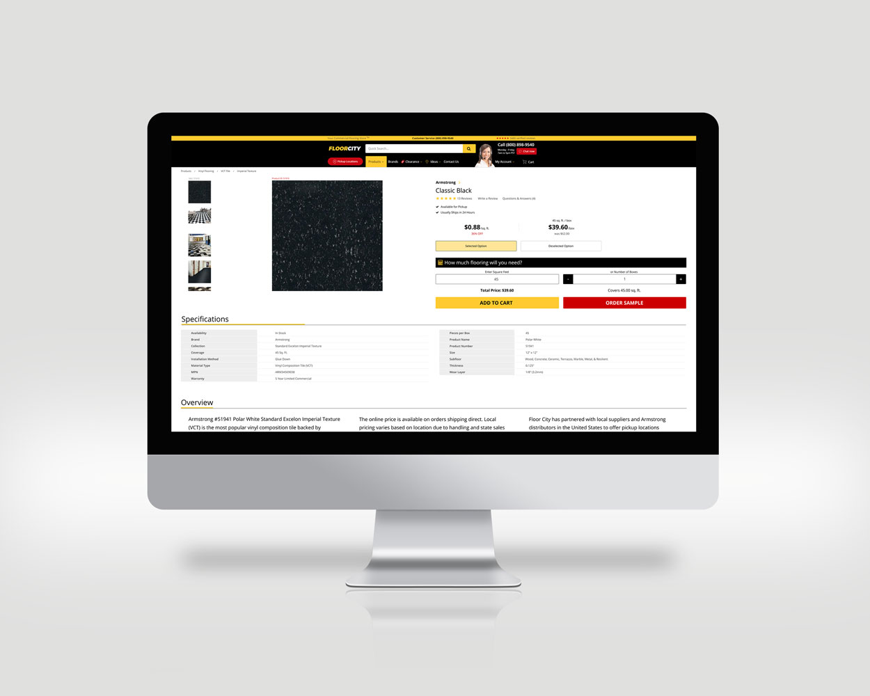
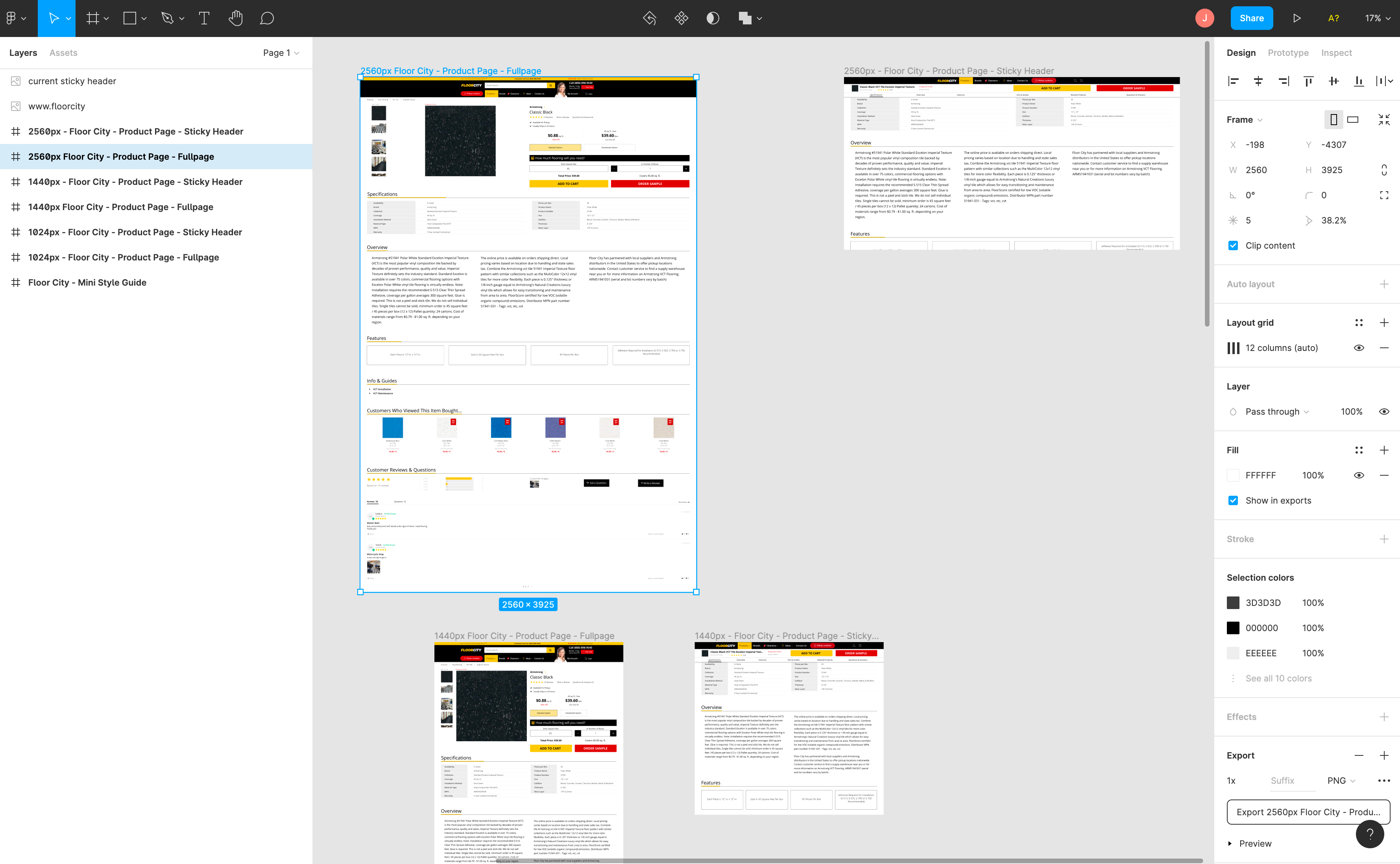
This project was for a client with a Shopify store that wanted to improve the look of their product pages. I drafted the composition in the design software, Figma, creating multiple viewing points for each page to demonstrate what the design will look like as the user scrolls down.
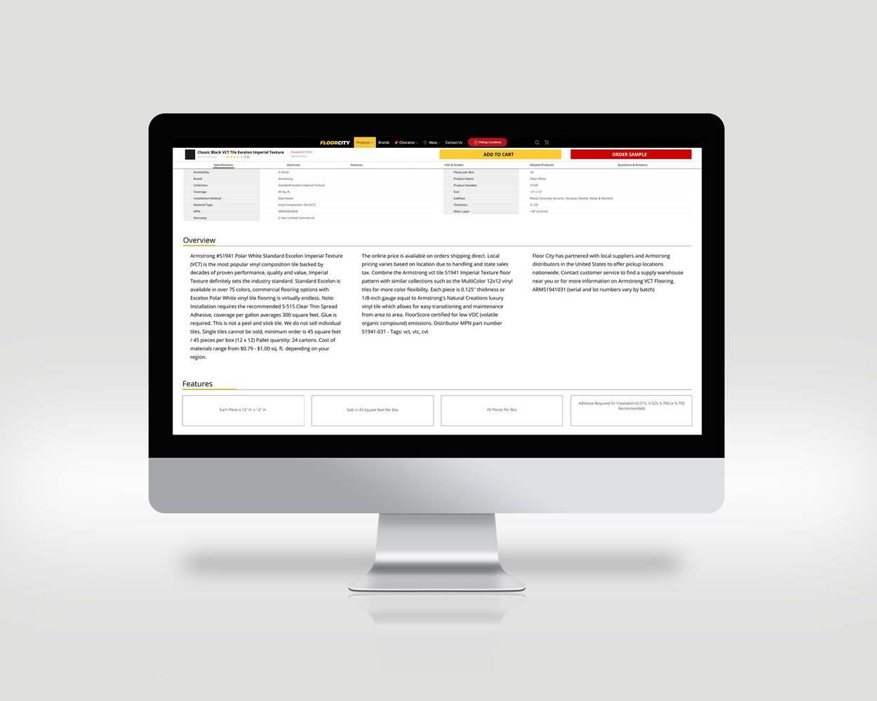
The client's key points for this redesign were to create a full-screen view for their customers on very large screens, with a 'sticky' fixed-header feature to ensure the add-to-cart button is always within view.
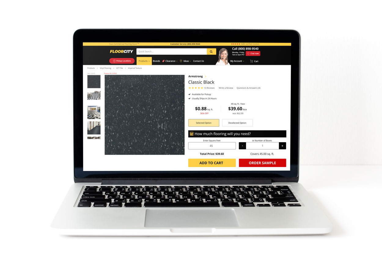
Included in the deliverables were compositions of the full product page as well as the product page with the fixed-header. I also included compositions of the same design for smaller laptop screens to ensure the client understood what the site would look like in a responsive manner.
- Client: Floor City
- Date: May 2018
- Service: Web UI/UX Design


